Welcome, Guest. Please login or register.

Login with username, password and session length


April 27, 2024, 08:01:29 AM
Funfani.com - Spreading Fun All Over!INFORMATION CLUBInformative ZoneHome Sweet HomeHow stylish are your windows?
Pages: [1]   Go Down
Print
Author Topic: How stylish are your windows?  (Read 3927 times)
0 Members and 1 Guest are viewing this topic.
Ryan Martis
FF Hero
*****

Karma: 86
Offline Offline

Gender: Male
Posts: 38649


« on: July 13, 2009, 02:05:04 AM »


Windows never fail to catch one's attention. Use this to advantage -- to create a mood, make a statement, or focus a view.

Think of your window as a canvas. By dressing it up using colour and detailing, you can brighten up any room. Of course, the window treatments should complement the room's décor. If possible, plan for your window treatments when you are renovating/ constructing.

Forget patterns and prints (unless they are really bold and defiant). Concentrate on the texture and drape of the fabric. Be creative. Experiment with painting, block printing and embroidery techniques to create a curtain/ blind that is yours and yours alone.

The best way to complement a good curtain treatment is the use of light. Natural light, table lamps, floor lamps and wall/ ceiling fixtures (even candles work just as well, if you want to be really creative) can enhance the setting. You can use different options to create different moods.

If someone walks into your house, sees the curtains/ blinds and remarks, "That's interesting!", you know you have hit the nail on the head.

Report to moderator   Logged
Ryan Martis
FF Hero
*****

Karma: 86
Offline Offline

Gender: Male
Posts: 38649


« Reply #1 on: July 13, 2009, 02:05:58 AM »

The master bedroom


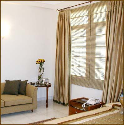
You are likely to spend a lot of time here, so make sure you don't tire of the décor easily. It should exude comfort and warmth.

The window in the picture belongs to a couple who wanted something formal yet simple. Colours were out, which left us with detailing.

Drapes

We chose simple drapes with a pleated heading and embroidered borders in the Greek key motif. They are hung from ceiling height on a simple but elegant drapery pole that has a copper finish and nice ends.

It is important to choose hardware with a contemporary design; the variety of options today allow for a lot more flexibility.

Illusion of height

Ceiling height curtains make the room look grand. The full height of the wall is used to make the room look bigger and pulls the eye upwards.

Detailing

The fabric is a textured, dull gold, silk fabric with an excellent drape that focuses on style-without-fuss. It is important to have a heavy drape with good pleats. The embroidery motif in olive green adds just the appropriate amount of detailing.

If the view from the window is good, use the lightest sheer to keep away the direct glare of sunlight.

On the other hand, if you have a bit of an eyesore to deal with (which is usually the case in the cities we live in), or another building facing your window, then a textured stripe or checked sheer would work best. It gets you the light, and keeps everything else away.

Blinds

In this picture, a semi-sheer check in three tones is used for the roman blinds.

These blinds have a dual purpose. Firstly, the fabric allows the light to filter in while providing the necessary privacy and hiding the view of the neighbouring house. Secondly, the blinds make the room look more spacious and are in line with the minimalist dcor.

The fabrics are in tones of olive, dull gold, off white and beige and complement the cherry wood finish.

Accessories

The bedspread coordinates with the drapes and accentuates the individuality of the room. A coordinated bedspread is the perfect companion to a well-thought out window treatment in a bedroom.

As long as all the elements in the room -- from the furniture to the fabrics -- look like they get along, your room is a beautiful place to be in. Even if one element is out of place, it could be visually disturbing.
Report to moderator   Logged
Ryan Martis
FF Hero
*****

Karma: 86
Offline Offline

Gender: Male
Posts: 38649


« Reply #2 on: July 13, 2009, 02:07:03 AM »

The dining space


It is not just the food that is going to score points out here (if your culinary skills are not that great, then working on the décor is absolutely essential!).

Inviting your girlfriend/ boyfriend over, entertaining your boss, or having a small get together of friends? Then your dining room must impress.

Make a statement


Since dining rooms usually have heavy furniture and few accessories, the window treatments should make a statement and bring some colour into the room.

The style of the furniture, the flooring, wood finish and wall colour would dictate the window treatment to a large extent.

To create a feeling of warmth and luxury, use warm tones.

Understated elegance

A dining area would generally have just one window.

In this picture, we have a formal dining area that needs to make a statement of understated elegance. The dining table and sideboard are in a deep walnut matt finish, which is offset by the burnt stripe fabric used on the blinds.

The diamond border in four colours on a soft apricot silk brings in the detailing.

The sheers are an off-white self-stripe that adds to the warmth of the room.

The illusion of space

The double blind system makes the relatively small dining room appear larger and the valance (short drapery, decorative board or metal strip mounted across the top of a window to conceal structural fixtures) dresses it up and gives it a formal touch. The apricot silk valance has embroidered borders that coordinate with the blinds and is casually draped over an antique bronze drapery pole. This makes it look contemporary, even as it retains the luxurious feel.

Inviting colours

Dining room windows should have colours that are inviting. Warm tones are better for rooms with less light and/ or dark wood finish. Cool summer colours are a perfect complement to the lighter wood finishes and bright, well-lit rooms.

If you are using curtains, ensure you have them drop from the maximum height possible to create a feeling of subtle opulence. A great view is best framed using a sheer fabric in pastel or summer tones in a heavy pleated drape.

Accessories

Coordinate table linen to complement your window treatment. Most people don't pay attention to this detail; those who do get compliments because it is a detail that always catches the eye. Sometimes, it even makes up for a not-so-impressive main course!
Report to moderator   Logged
Ryan Martis
FF Hero
*****

Karma: 86
Offline Offline

Gender: Male
Posts: 38649


« Reply #3 on: July 13, 2009, 02:07:48 AM »

Contemporary designs


Modern décor puts an emphasis on lines.

A well-done curtain can highlight your home's desirable architectural features, even as it camouflages its shortcomings.

Style without fuss

In the example shown, a fabric in a neutral tone (as close to the wall colour as possible) is used to ensure that one can keep the curtains drawn all day.

A simple textured fabric is used with blackout lining in this bedroom that also doubles as an entertainment area. The lining keeps the light out so as not to obstruct television viewing during the day.

Infuse some drama

A six-inch band of suede fabric in deep forest green adds to the effect. The suede fabric acts as a heading and makes the room look contemporary.

Why suede? Well, it looks terribly hip! The eyelet drapes keep it simple, while the chrome finish rod coordinates perfectly with the walnut and stainless steel cabinets, bed and chairs.

Often, a contrast fabric used on the heading or along the length of the drapes is the best way to create the necessary embellishment, without interfering with the modern décor. The borders can be plain or with eyelets that have a sash running through it in a third colour that makes it look even funkier.

A formal look would just require a bit of appliqué on the borders with a small beaded fringe.

Colours

The colours used in the border could be an offset in a bright colour or it could be a tone-on-tone (two shades of the same color used together with out a line of a contrasting color to separate them) depending on whether you want to bring some excitement in, or create an understated elegance.

Did you notice the coordinated fabric made-to-order for the chairs? Or the floor cushions? Small details. Big effect!
Report to moderator   Logged
Ryan Martis
FF Hero
*****

Karma: 86
Offline Offline

Gender: Male
Posts: 38649


« Reply #4 on: July 13, 2009, 02:08:39 AM »

Blinds instead of curtains


By and large, unless it is a living or dining room, master bedroom or large French windows, blinds (something, such as a window shade or a Venetian blind, that hinders vision or shuts out light) are generally a better option.

Why blinds

They keep the look simple and the need to use full-length curtains is reserved for formal areas.

Bedrooms that have half-size windows, are ideal for blind concepts. A blind does not have to be just one flat piece of fabric; it offers a whole host of opportunities to exercise one's creativity.

Experiment

One such possibility is the fan design that brings out the existing window feature and turns the window into a picture frame.

The stripe fabric brings in a lot of colour and is ideal for this particular design. The pastel green combined with a deep rust; peach and beige complement the natural teak furniture.

The tab top design allows for the use of a pole as an added feature. This one, in a bronze finish, has some interesting ends that serve as an embellishment.

Play with light

The blinds are kept half raised to allow the light to stream in and serve as a backdrop for the fan. The bedspread, in matching colours, makes an otherwise small and non-descript room look warm and inviting.
Report to moderator   Logged
Ryan Martis
FF Hero
*****

Karma: 86
Offline Offline

Gender: Male
Posts: 38649


« Reply #5 on: July 13, 2009, 02:09:27 AM »

A teenage boy's pad


A teenage boy's room should have bold colours and reflect his personality and taste in some way. This boy's favourite colours are blue and yellow, as is evident.

The golden cedar furniture offsets the blue and yellow used on the blinds.

The cotton fabric keeps it informal. The check design has been created using two plain fabrics and stitching them together in a patchwork design. A cross-stitch detail in metal thread gives it a contemporary feel.

The blinds have a tab top heading with yellow buttons, fitted on a nickel finish rod with cedar finials (a sculptured ornament, often in the shape of a leaf or flower, at the top of a gable, pinnacle, or similar structure).

The blind concept has been repeated inversely on the bedspread, thereby tying in the concept with the furniture and décor.

Generally, cotton fabric works best in a boy's room as they come in bright colours and do not look formal. They are also cheaper and thus easy to re-do in another colour/ design when the person gets bored of the style or grows out of the concept, as they often do.
Report to moderator   Logged
Pages: [1]   Go Up
Print

Jump to: