Welcome, Guest. Please login or register.

Login with username, password and session length


May 08, 2024, 06:53:42 AM
Funfani.com - Spreading Fun All Over!INFORMATION CLUBInformative ZoneAwarenessHow 10 Famous Logos Have Changed Over Time
Pages: 1 [2]   Go Down
Print
Author Topic: How 10 Famous Logos Have Changed Over Time  (Read 3174 times)
0 Members and 1 Guest are viewing this topic.
Vince Keegan
FF Hero
*****

Karma: 4
Offline Offline

Gender: Male
Posts: 30757


« Reply #6 on: September 04, 2014, 06:36:03 AM »


Canon


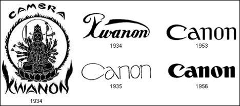
The Japanese imaging products company actually started life as Kwanon. The name was taken from the Buddhist bodhisattva Guan Yin, who is known in Japan as Kannon. When the company expanded in 1935, they adopted a name that they thought would appeal to a wider audience. Since “canon” had a similar pronunciation and positive associations, the word became the company’s new name. With the new name came a new, simple logo: the company’s name in a typeface which at that time did not exist in North America or Europe. Since then the logo has undergone a few refinements, but no major overhauls.

Report to moderator   Logged
Vince Keegan
FF Hero
*****

Karma: 4
Offline Offline

Gender: Male
Posts: 30757


« Reply #7 on: September 04, 2014, 06:36:14 AM »

Microsoft


Most technology companies are particularly concerned with keeping up with the times, which makes perfect sense. Microsoft, however, does not seem to care as much about keeping their image interesting as some other tech outfits. Microsoft’s original logo (from 1975) was a disco-type font which didn’t last long. The second logo (used from 1982-1987) featured a distinctive “O” which was known within Microsoft as a “blibbet.” In 1987 the current “Pac-Man” logo was adopted (so called because of the slashed “O”) and since then various tag lines have accompanied the logo.
Report to moderator   Logged
Vince Keegan
FF Hero
*****

Karma: 4
Offline Offline

Gender: Male
Posts: 30757


« Reply #8 on: September 04, 2014, 06:36:26 AM »

Xerox


You have to hand it to Xerox: they have come back from so many challenges – from market changes to accounting scandals – to keep on doing business more than a century after the company was founded. These days it seems like they spend more time trying to keep their company name from becoming a common verb than actually doing business, but they bravely soldier on. Their most recent logo reflects the company’s desire to prove that they are more than just copiers.
Report to moderator   Logged
Vince Keegan
FF Hero
*****

Karma: 4
Offline Offline

Gender: Male
Posts: 30757


« Reply #9 on: September 04, 2014, 06:36:36 AM »

IBM


Name changes, mergers and changing times amounted to a century of logo updates from IBM. However, the most recent logo has remained in place for nearly forty years now while the machines sold by IBM have changed dramatically.
Report to moderator   Logged
Vince Keegan
FF Hero
*****

Karma: 4
Offline Offline

Gender: Male
Posts: 30757


« Reply #10 on: September 04, 2014, 06:36:43 AM »

Volkswagen


Volkswagen, one of the world’s most beloved car brands, actually started out life as a pet project of Adolf Hitler. After WWII, the British took control of the company and removed the graphical Nazi elements from the logo. The company’s long, fascinating history has led to surprisingly few logo redesigns, with the company choosing instead to stick with the familiar stacked letters inside a circle.
Report to moderator   Logged
Pages: 1 [2]   Go Up
Print

Jump to: