Welcome, Guest. Please login or register.

Login with username, password and session length


May 02, 2024, 03:14:06 AM
Funfani.com - Spreading Fun All Over!INFORMATION CLUBInformative ZoneAwarenessHow 10 Famous Logos Have Changed Over Time
Pages: [1] 2   Go Down
Print
Author Topic: How 10 Famous Logos Have Changed Over Time  (Read 3168 times)
0 Members and 1 Guest are viewing this topic.
Vince Keegan
FF Hero
*****

Karma: 4
Offline Offline

Gender: Male
Posts: 30757


« on: September 04, 2014, 06:34:13 AM »


A company’s brand is a succinct but comprehensive embodiment of everything the company stands for. The best logos are recognizable, memorable and let you know what the company is about with just a glance. But even the biggest companies in the world have to change with the times and grow as their brand grows. While rebranding is an expensive (and sometimes risky) undertaking, these companies have thrown caution to the wind and changed up their logos – and most of them have done it over and over.

Report to moderator   Logged
Vince Keegan
FF Hero
*****

Karma: 4
Offline Offline

Gender: Male
Posts: 30757


« Reply #1 on: September 04, 2014, 06:34:34 AM »

Pepsi


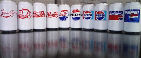
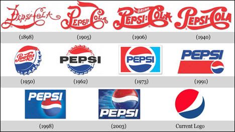
Officially trademarked in 1903, Pepsi-Cola has gone through many changes over the years. Though each individual change wasn’t drastic, the evolution has led to a logo with no trace of the original. This shouldn’t come as a surprise considering the first few iterations looked surprisingly like the logo of their main competitor, Coca-Cola. The latest of these changes took approximately 5 months of research and cost in the neighborhood of $100 million (including costs of changing old logos and marketing literature).
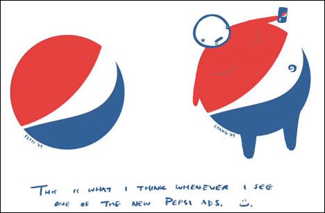


It didn’t take long after the introduction of the new curvy logo for Lawrence Yang to notice that it looked a bit like…well, a guy who enjoyed a bit too much Pepsi. His hilarious (and free!) revamp of the new logo has been floating around on the Internet and reminding people of a bloated fat guy since 2009.
Report to moderator   Logged
Vince Keegan
FF Hero
*****

Karma: 4
Offline Offline

Gender: Male
Posts: 30757


« Reply #2 on: September 04, 2014, 06:35:31 AM »

Starbucks


Like Nike and Pepsi, Starbucks’ logo recently evolved away from including the company name. The famous woodblock mermaid illustration now stands on her own sans the signature Starbucks font.


Also like Pepsi, the 2011 logo change inspired some further logo alteration. This illustrated “future” of Starbucks’ logo takes the company’s trend to its logical conclusion: a close-up so extreme you can no longer tell what in the world it is supposed to be.
Report to moderator   Logged
Vince Keegan
FF Hero
*****

Karma: 4
Offline Offline

Gender: Male
Posts: 30757


« Reply #3 on: September 04, 2014, 06:35:40 AM »

Nike


Nike’s famous ‘Swoosh’ logo is universally recognized. Created in 1971 by a graphic design student at Portland State University (who was paid just $35 for her work), the logo was first used with the brand name appearing behind it. Though the original logos were never retired (you can still purchase ‘vintage’ gear with the original logos), a little over a decade after its inception the company opted to drop the brand name in favor of the ‘Solo Swoosh’.
Report to moderator   Logged
Vince Keegan
FF Hero
*****

Karma: 4
Offline Offline

Gender: Male
Posts: 30757


« Reply #4 on: September 04, 2014, 06:35:49 AM »

Wal-Mart


Before it became the giant retailer that it is today, Wal-Mart was a single discount store in Rogers, Arkansas. As the company grew by leaps and bounds, the logo underwent only minor changes. The “Discount City” logo introduced in 1968 was used on employee smocks but never on store signage; when you take that logo out of the timeline it seems that the retailer hasn’t made many drastic changes over the years. The most noticeable alteration was in 2008 when the star was moved from the middle of the name to the end, leaving the official Wal-Mart logo without a separator (like a hyphen or a star) for the first time in over 40 years. Interestingly, the current logo looks quite a bit like the company’s original logo.
Report to moderator   Logged
Vince Keegan
FF Hero
*****

Karma: 4
Offline Offline

Gender: Male
Posts: 30757


« Reply #5 on: September 04, 2014, 06:35:56 AM »

Apple


Today, Apple has one of the most recognizable logos in the world, but the company’s first logo was a complicated mess featuring Isaac Newton sitting under a tree, apple dangling above his head. The too-complex logo was scrapped after less than a year in favor of the iconic rainbow apple with a bite missing. When Steve Jobs returned to the helm of the company in 1997, the old rainbow was ditched in favor of a sleek, stylish monochrome apple which now features prominently on every product the company sells.

Go to The NEXT Page for More Pictures >>>
Report to moderator   Logged
Pages: [1] 2   Go Up
Print

Jump to: